Overview
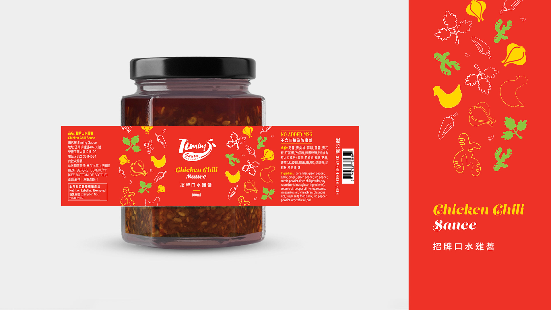
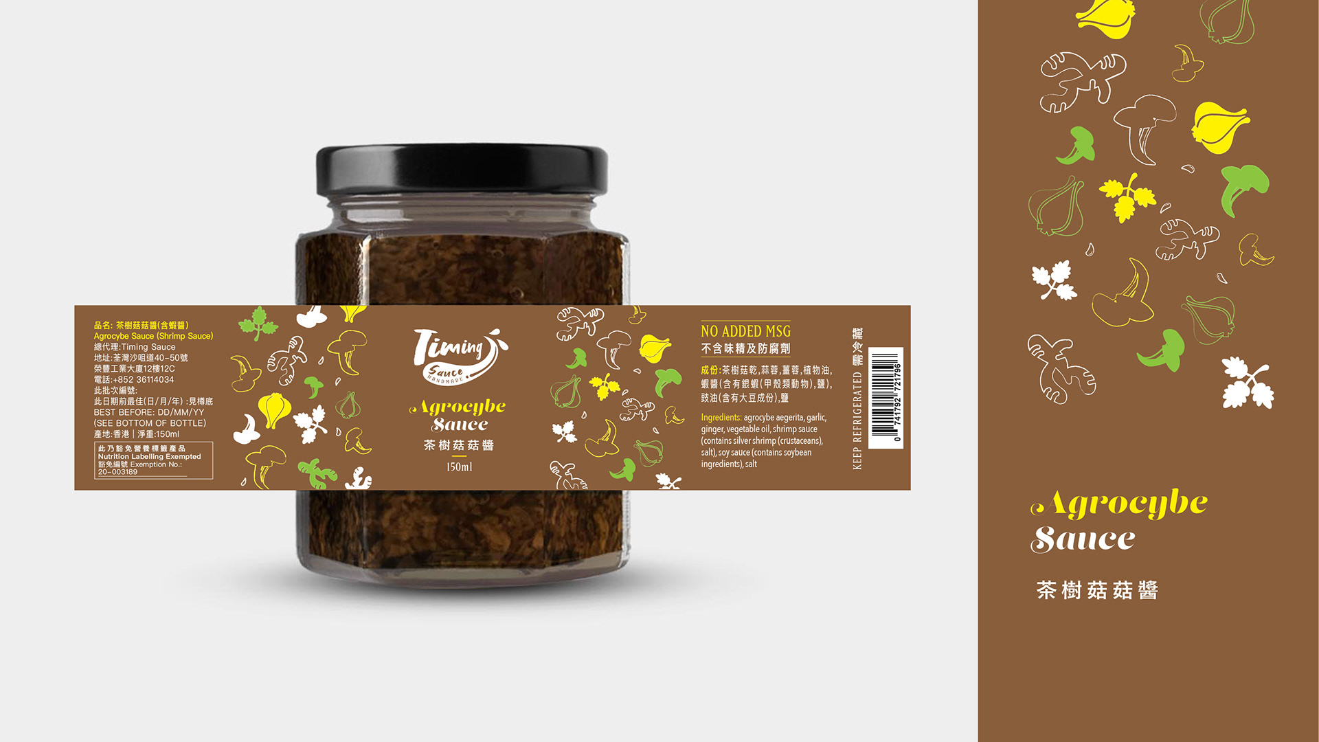
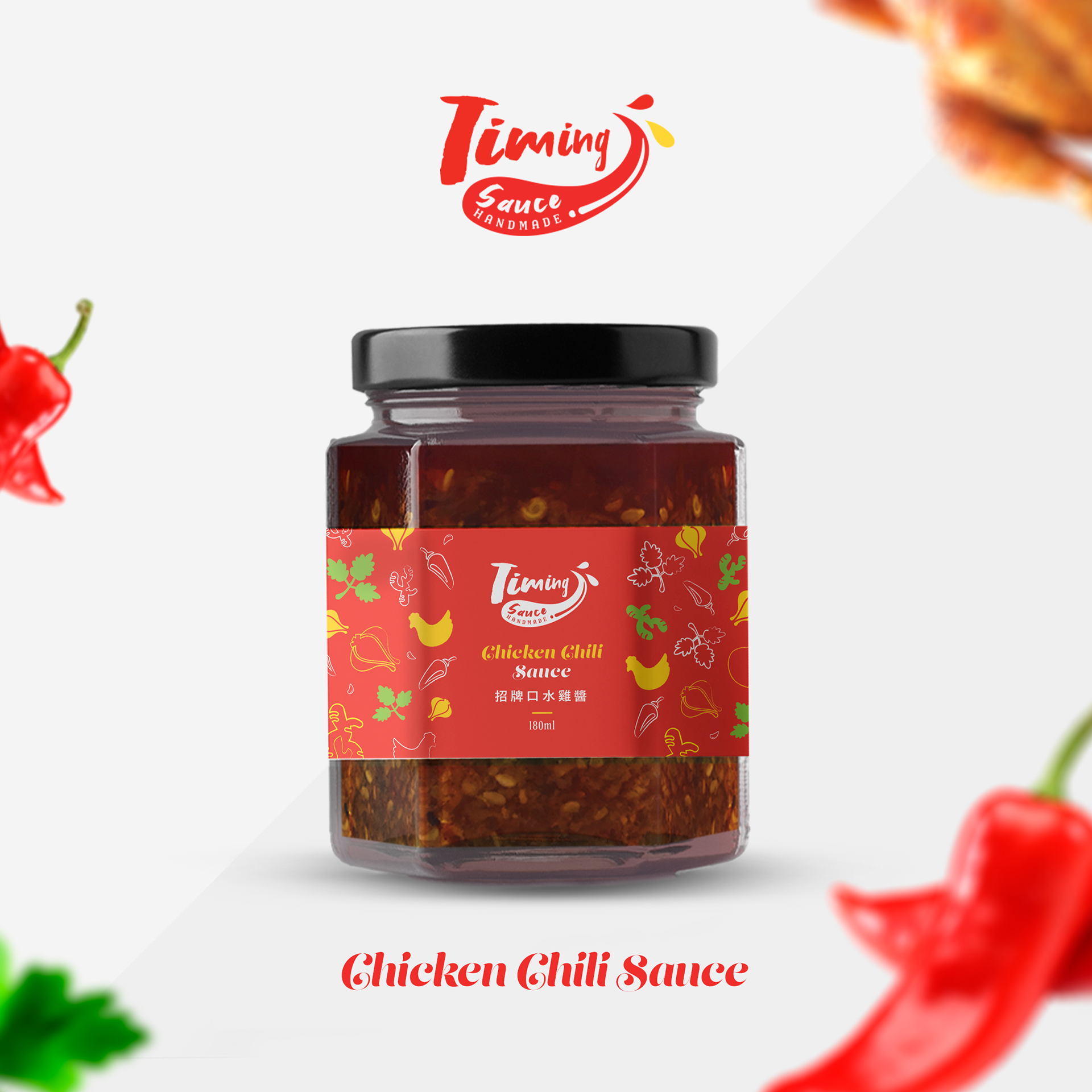
Timing Sauce is a start-up company in Hong Kong. The founder Lok, was a chef from five-star hotels a few years ago before she built her brand to sell handmade sauces. Chicken chilli sauce and Agrocybe sauce are their signatures. All products are No MSG and Preservative.
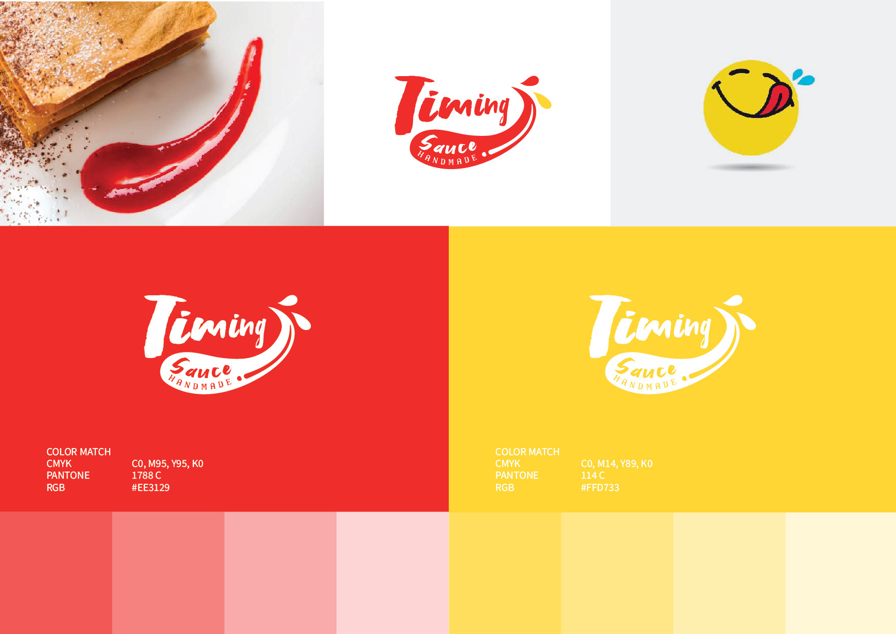
The vision of Timing Sauce is to promote happiness via food and hope that people can live at the moment. The logo was designed with an abstraction to present the Sauce and a yummy face. The logo aims to bring out a yummy atmosphere when you see the logo.
Inspiration
In the beginning, Lok came to me and said she wanted to rebrand her brand and increase sales and awareness. After we discussed this, we wanted to bring out joy and happiness when people saw their brand. (the vision of Timing Sauce.) After researching the industry and competitors, we desired to create an emotional connection with the design. We are trying to make the audience feel happy and yummy.
Design Direction
We have two directions in the design which promote happiness and deliciousness (Stimulate appetite). The logo was designed with an abstraction to present the Sauce and a yummy face. We used an abstract way to express the "Sauce" and "Yummy faces" The logo aims to bring out a yummy atmosphere when you see the logo.
Design Process
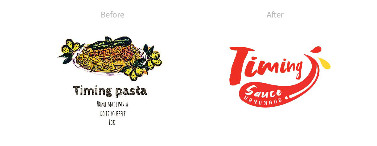
Before rebranding, the brand name was Timing Pasta which was irrelevant to the existing products that they were selling. Therefore, the first mission is to change the brand name to be more connectivity and unique. So I have a bold idea, she must change the brand name. Renaming is a risk for every brand. But it needs to be renamed because the brand reflects the products (connectivity and uniqueness).
After the name has changed to Timing Sauce, it's time to work on the brand identity like logo, packaging, sales material, etc. To do so, we started to rethink what the brand stands for, its market position, how the brand comes to impress your buyers, and what their target customers are.
Logo Design Process
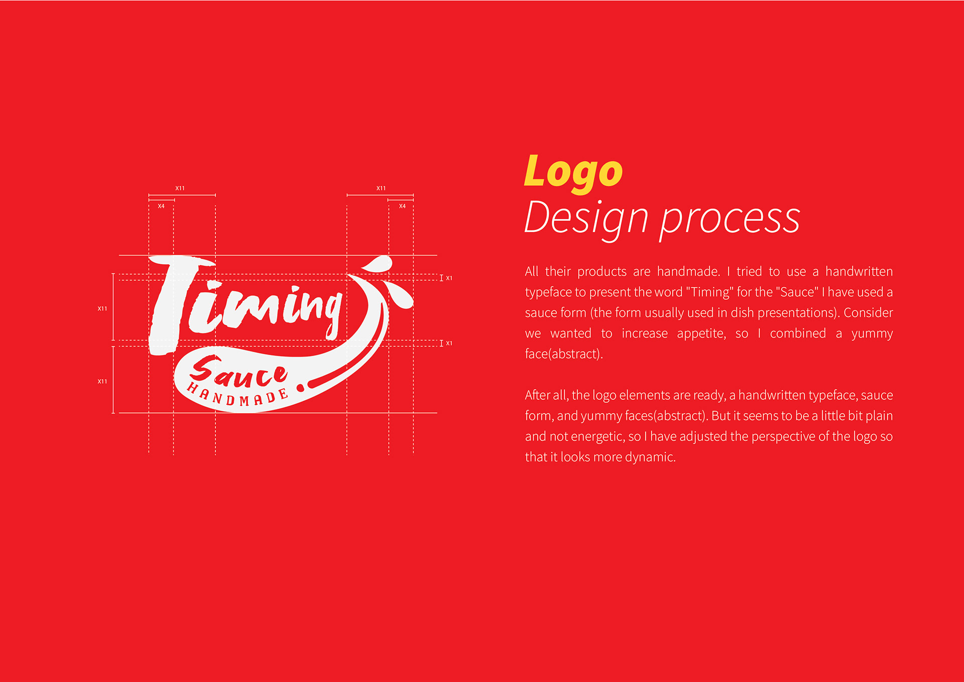
All their products are handmade. I tried to use a handwritten typeface to present the word "Timing" for the "Sauce" I have used a sauce form (the form usually used in dish presentations). Consider we wanted to increase appetite, so I combined a yummy face(abstract).
After all, the logo elements are ready, a handwritten typeface, sauce form, and yummy faces(abstract). But it seems to be a little bit plain and not energetic, so I have adjusted the perspective of the logo so that it looks more dynamic.
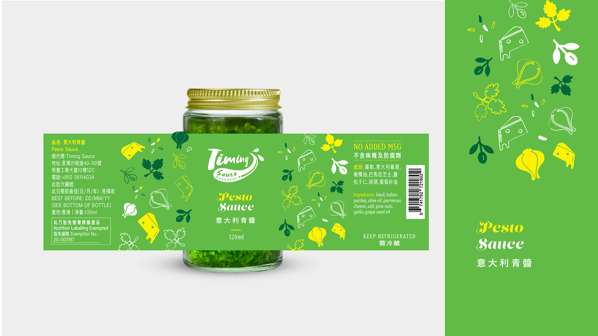
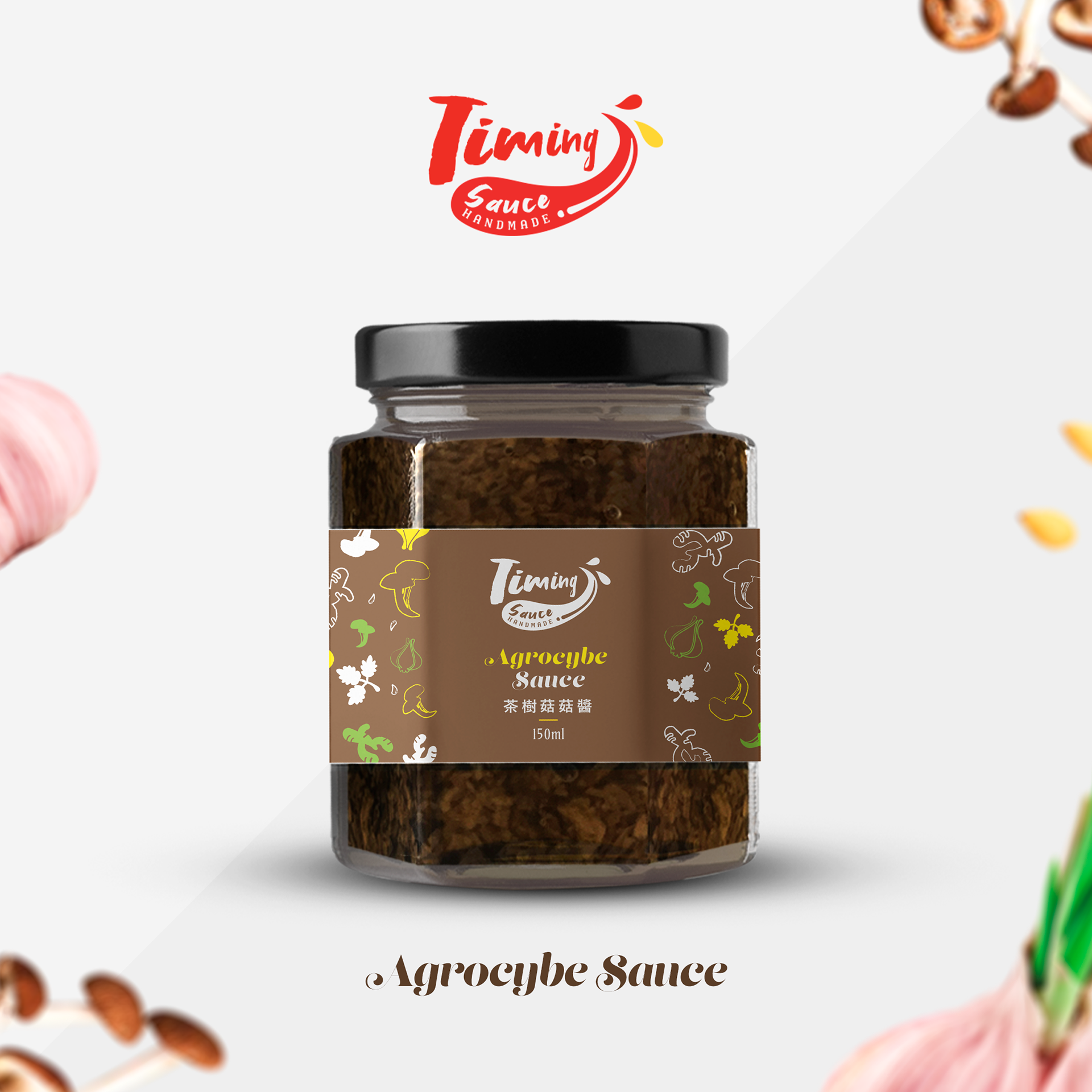
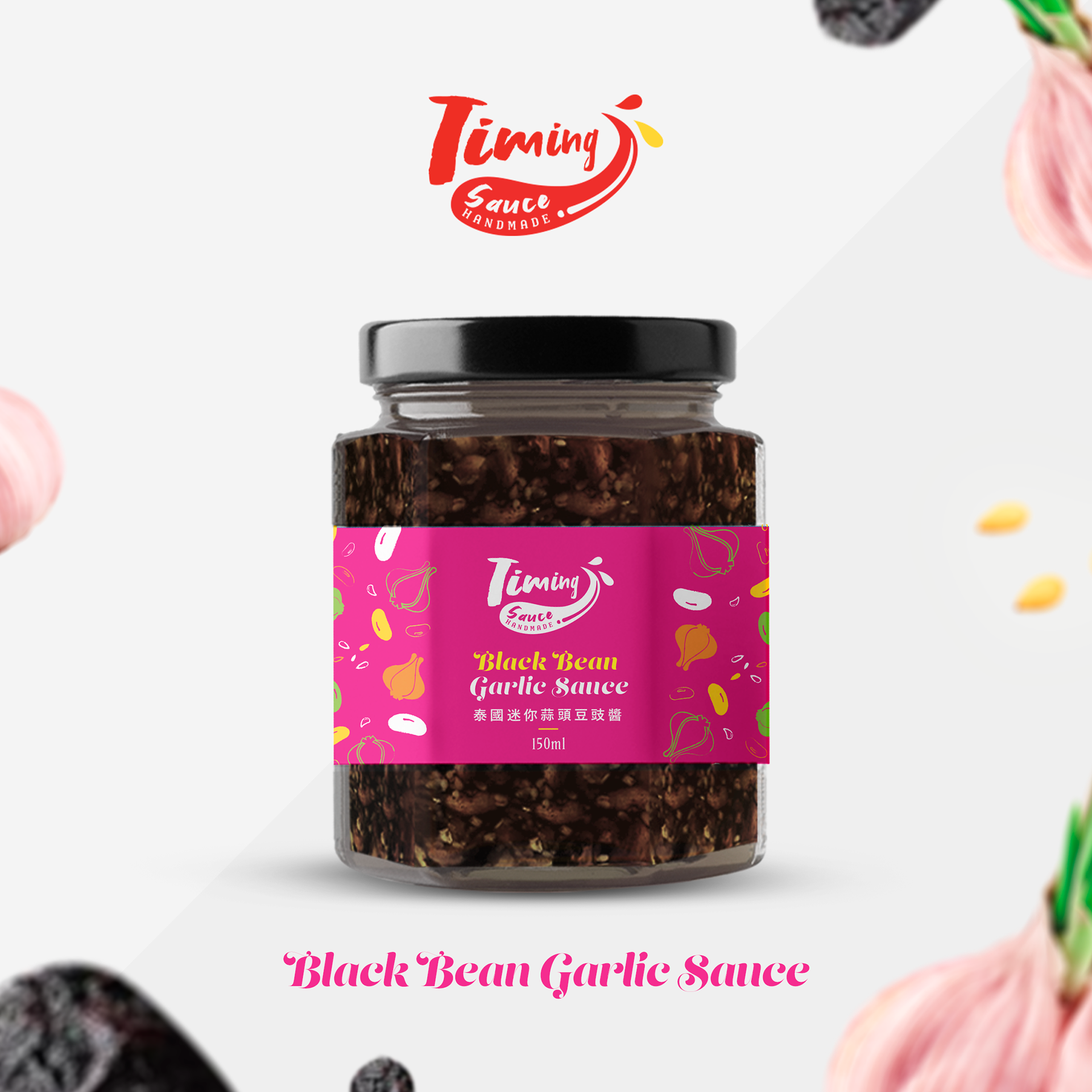
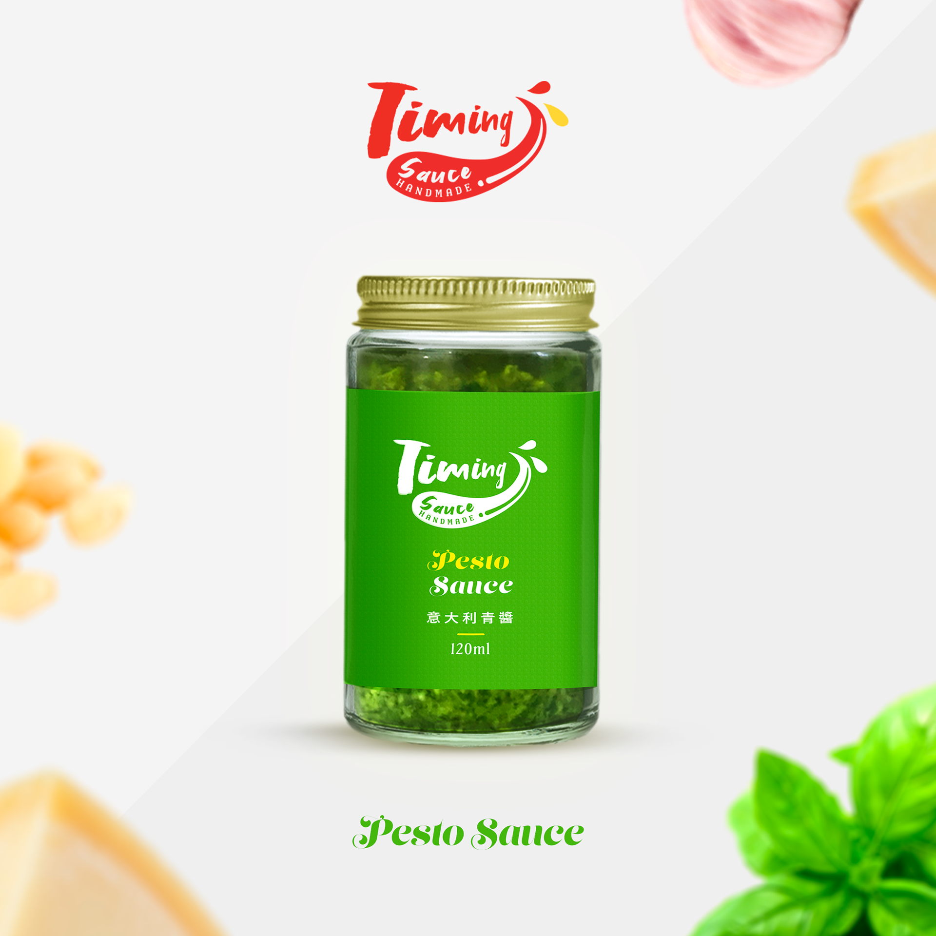
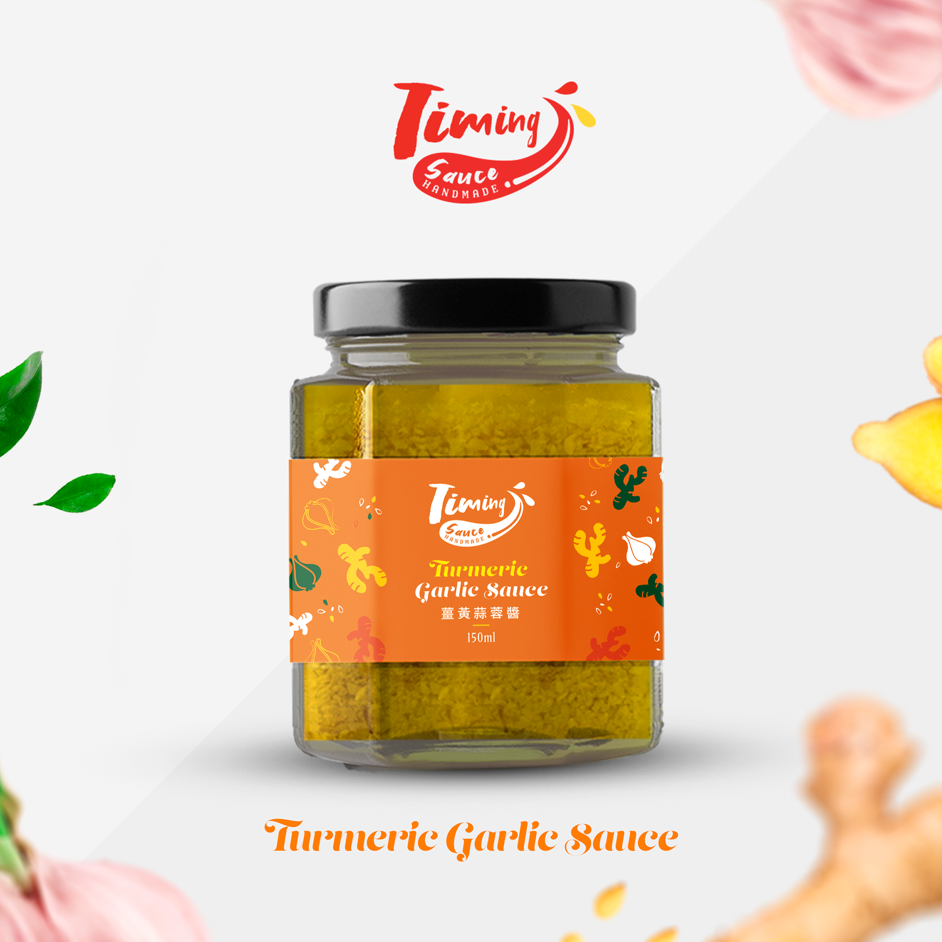
Packaging Design process
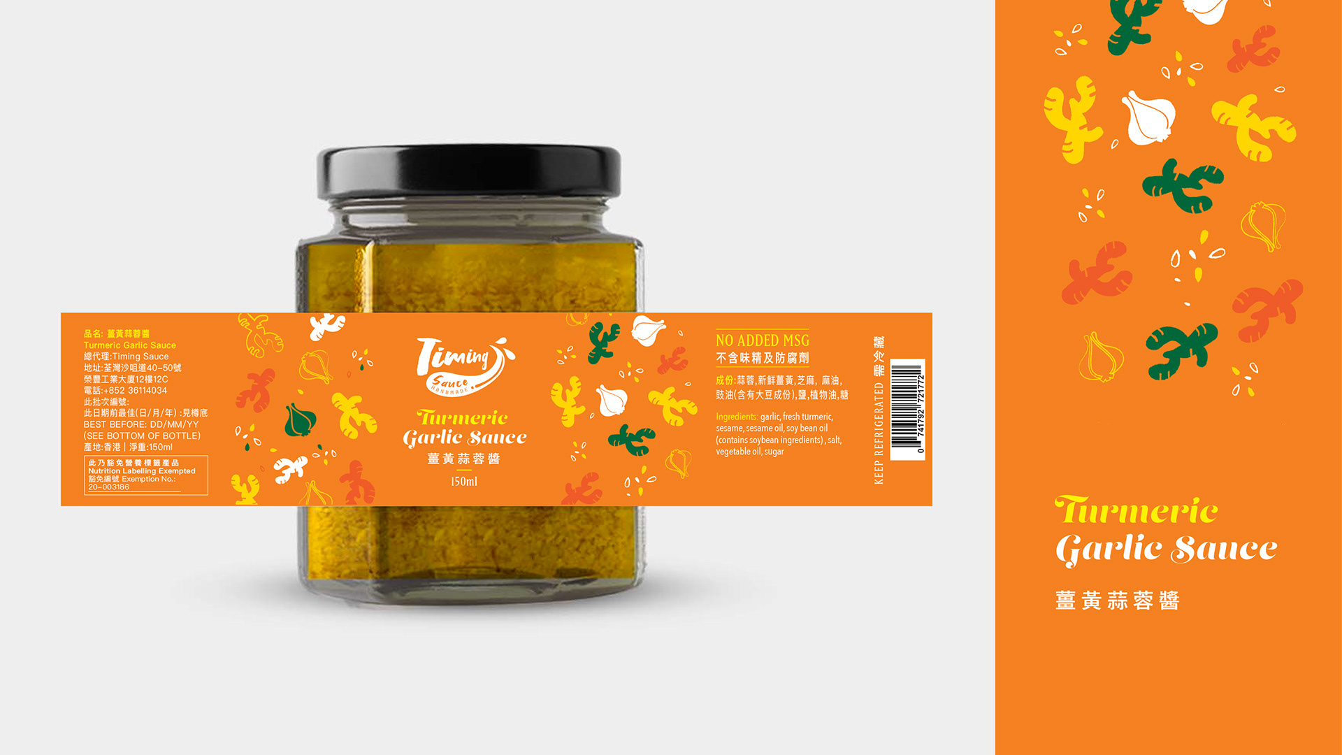
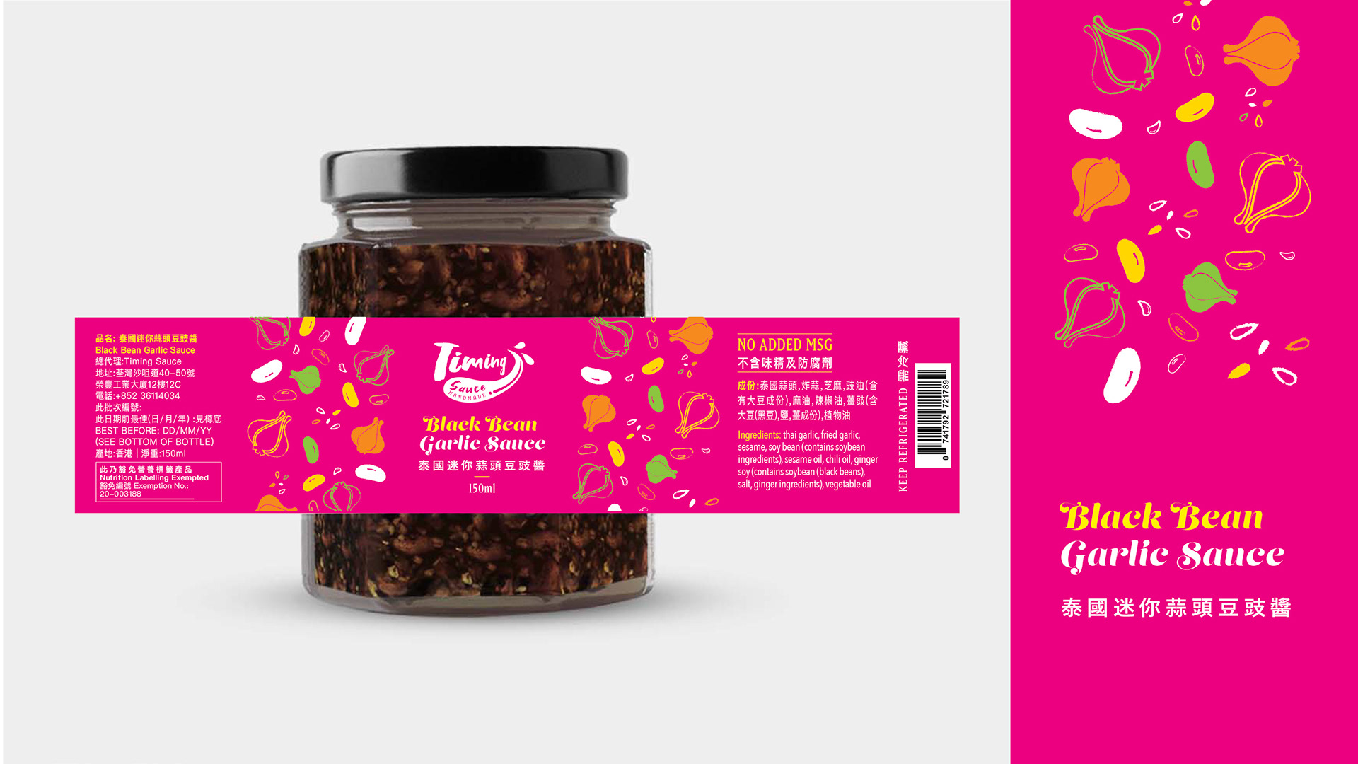
In the packaging design, we considered the visual extension of the brand. We expect to emphasize the connection with the products through the color, such as ingredients and the sauce colors, which we also incorporate with color psychology.
When we designed the color direction/themes, we also considered the first impressions on the brand when customers saw it in supermarkets. We aim to deliver happiness and energy through colors that can stimulate emotion and appetite.